Concept
This assignment brief involves exploring portrait photography. The aim is to create three portrait photographs including a self portrait, someone I know and also one of a stranger. These photographs do not have to be linked to each other, either conceptually or visually.
Portrait: A picture of a person who knows they are being photographed
Influences
Thomas Ruff is a German photographer (born 1958). During 1981 and 1985 he took 60 portraits in his studio which were mid shots (head and shoulders). ‘Passport-like images’ are how they are commonly described because of the framing (cropped just above the top of the hair, even lighting and the use of a flash resulting in no motion blur). His portraits are taken with a 9x12cm negative.
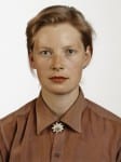
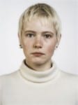
These images have a plain white background which is what I used for my self portrait. I also cropped my image just above the hair and just in from my shoulders. To make my image different I made sure I wasn’t face-on to the camera but slightly to the left. Also, unlike the people in his photographs I had a smile on my face rather than an emotionless expression. These aspects made my image un-like a passport photograph but still has similar aspects to Thomas Ruff’s portraits.
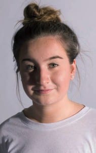
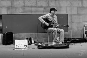
Frank Huen–
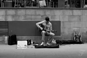
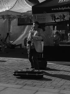
Iain Campbell-
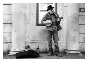
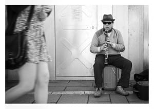
These photographers images of strangers (buskers) are in black and white. This colouring gives the image quite an isolated feel which relates to the idea of capturing a stranger because the photographer has no connection with them making the relationship feel quite distant.
This is my response to these photographers work:
Alternatives
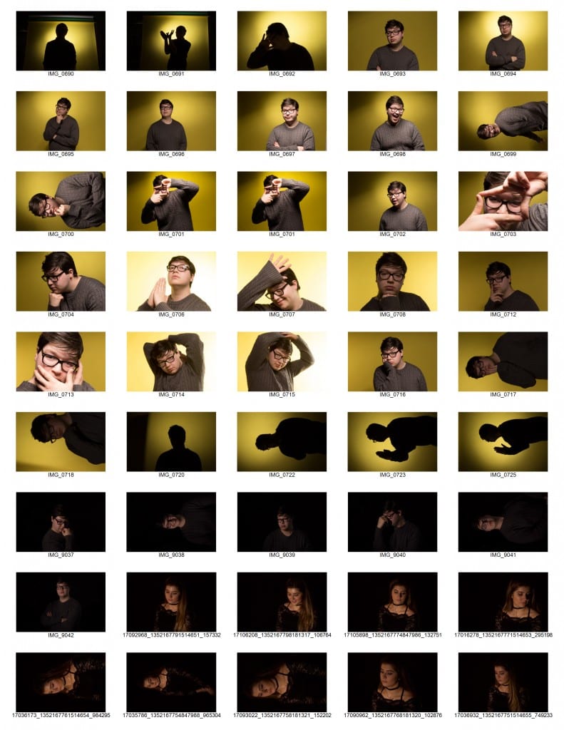
Workshop 6 photographs of friends, taken in the studio with different coloured backgrounds and different amount of light.
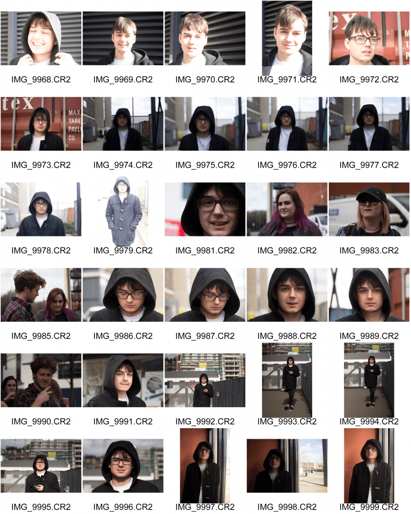
Workshop 7 portraits- during the workshop in week 7 we took some portrait photographs around the university campus. I experimented using three different lenses including a kit lens and a telephoto lens. I found this interesting as I had never used these before so didn’t realise how much of a difference they made.
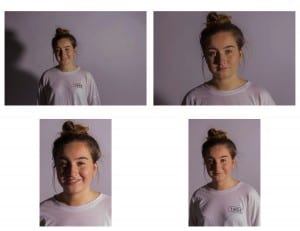
These are my other variations to my self portrait. I decided it was more appropriate to crop the image to a portrait orientation because the background does not need to take up too much of the image as it is plain and uninteresting. I had Thomas Ruff’s work in mind when creating my final image.
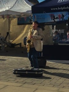
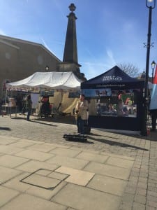
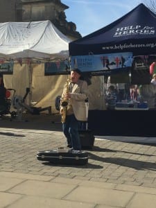
Alternatives of my stranger photo:
I decided to crop the photo so the frame is more filled with the busker (but not too much as I didn’t want to cause it to be pixelated) to attract the viewers attention to him.
Reflection
I learnt a lot of new things about portrait photography on this module, for example ‘the eyes are the window to the soul’. (Having your subject looking into the camera can create a completely different feel to if they are not). For example in my familiar photo, my subject was looking to the left of the camera which made it look like he was caught in an action scene. Compared to my self portrait, where I am looking into the lens, which portrays me in a friendlier light because there is a stronger relationship with the camera. I decided to edit my stranger photo to black and white to represent the distant relationship I had with the subject. I also did this to fit in with the influence I took from the photographers I looked at.
Leave a comment